Sunday, August 22, 2010

logo: next level fitness

another talented friend of mine, jonathan brawley, asked me if i could help design a logo and business card for his personal training business, next level fitness.


for the final logo, i sketched a figure running to appear as if it's running up a hill or a set of steps towards a 'next level.' i also liked the contrast in the font itself, fluid lines mixed with rigid lines.
i worked on three different designs for his business cards, all to be printed on white card stock. he ultimately liked the simplicity on the front card design in option 1 and the back card design in option 3. the final result ......


Friday, May 14, 2010

logo: korey banks photography

a talented friend of mine, korey banks, asked if i could help him with a logo to establish a brand for his growing photography business- and of course i gladly accepted! the process for the logo design was a back-and-forth collaborative effort with korey. he had a general direction in which he wanted his logo to go, so i was there to craft and guide him towards the end result.


above are some process images of different ideas i came up with initially for korey. he wanted a hand quality aesthetic so i incorporated my own handwriting into different ideas for his logo. i love the contrast of handwritten fonts paired with clean sans serif fonts, so i included some century gothic into the mix.


i then took the above three logos and cleaned them up a bit as well as incorporated them into korey's photos to use either as a header for his blog/ website or as an example of how he can place his logo within this photographs.


i took the logos further by incorporating korey's suggestions and finally narrowed it down to the final three. i also began to incorporate a color scheme that korey was wanting for his brand.

and the winner is...... #2!!


a good collaborative effort by all!

Monday, March 22, 2010

thought bubbles...

one of my new years' resolutions is to make a stronger attempt to finish projects/ tasks that i start. i challenged myself to this resolution because i tend to find myself with countless pending projects/ ideas that sometimes don't quite get finished. i have to confess- i haven't been very successful. i'm beginning to think its due to the fact that i have constant thought bubbles popping up all around me throughout my day. if you were to look at my desk, planner, or sketchbook- there are post-it notes and doodles scattered everywhere...thinking that one day i'll get to them. yeah right.


to sum it up- in response to a
good friend's post [suzanne cabrera]- i would say i am very much a chronic project starter who enjoys the process the most [even though the results are just as rewarding] because the process is where the learning takes place. i enjoy learning new ways to take on a project and feel that as each project passes- a new story is written.

Friday, March 12, 2010

from hand to paper

thanks to my obsession with fonts- i've ALWAYS wanted to turn my handwriting into a font. so i've told myself that i should quit wanting and just do it. i'm not quite sure of the process in making a font but figuring it out is part of the fun.

here is a sneak peak but more editing to come...

Wednesday, February 24, 2010

community by design: logo work

one of a few projects that i have my hands on right now is working with a very talented group of designer in a collaborative design effort where we focus our creativity and design skills in helping the community. this effort has come to be known as community by design.

one of the many things that are in the works right now is our brand- how can we graphically represent ourselves through a logo, website, + print material. step one is obviously creating a logo- and this is where addie brown and i come in. many revisions have already taken place with more to come-- but we are definietly getting warmer towards the final result. see our process below and expect more to follow....


take 1:

take 2:

take 3:

Friday, February 5, 2010

love is in the air

to my utter delight-- i found a floating heart in my afternoon coffee foam yesterday. i'm thinking it is a sign from cupid that something is coming my way...

on that note...

HAPPY early VALENTINE'S DAY!

Sunday, January 31, 2010

since graduation- i've found myself having a lot more free time [imagine that!]. within the past couple months- i've begun to work on some small projects that i have never had the opportunity [or energy] to complete while working on the plethora of school projects. one of which is making jewelry.....something i've always wanted to try since starting a job at the jewel box [a local fashion jewelry + accessory store]. although i haven't stretched my skills past earrings yet- i have really found myself enjoying the art of making jewelry. despite my interests in metal working- i've only been able to work with sterling silver attachments and semi-precious gem stones. here is an example of a pair i made for my mom for christmas....more to come later:

Saturday, December 19, 2009

my little one month old

after about a month of giving birth to the salvation army select store-- it has been quite rewarding to see how it has evolved and changed even within just a month of its life [if you remember my earlier post on the whereabouts of my creativity from may 2009 until now as i completed my senior honors thesis project with matt jones] the space has adapted to the influx and type of merchandise that has come through the store's donation center and a christmas tree has been added to the family of accessories within the store.

here are some images of the store-- enjoy and please stop by::


Saturday, December 5, 2009

a hatteras thanksgiving 2009

on our annual vacation to our beach house in avon, north carolina-- me and my brother and cousins spent an evening during sunset on the sound to snap some pictures. and this is the outcome-- hope you enjoy:


Wednesday, July 8, 2009

grease to green.

who would of thought- mcdonald's- of all restaurants- will be opening up their first 'green' restaurant that will provide electric vehicle charging. lucky for us north carolinans- it will be opening up in cary, nc on july 14th!

'the mcdonald’s features an array of green technologies and is designed to use as much daylight as possible, comes equipped with highly efficient water and kitchen fixtures, and uses drought tolerant plants. the fitout makes use of materials like sunflower seed boards, wheat boards, bamboo and kirei boards. recycled materials were used in the construction of the building, and an energy efficiency dashboard provides real time updates about the restaurant’s green stats to guests.'

follow inhabitat.com for more info regarding the restaurant!

Tuesday, June 2, 2009

thesis: salvation army

as the spring semester ended in the middle of may- there was barely any room to breathe before summer thesis started towards the end of may. my original thesis project was going to be with our design/build project-- urban s t u d i o centered around my LEED administrative duties but another option presented itself just days before summer classes began.

my thesis project now is going to be with the local salvation army organization. through a strong established relationship with them that started last fall- they have asked me- along with another classmate of mine-matt jones-- to design the interiors of their new 'boutique' store that they are opening up in northern greensboro. we are going to be working with our mentor/professor- suzanne cabrera- to establish a new image for the salvation army retail locations. please follow this link to stay tuned with the process of the project...

Wednesday, May 6, 2009

happy cinco de mayo aka happy end of the semester!

so yesterday marked our last and final presentation of our fourth year! wow...i can't believe that we made it through this program..it sure has been quite a roller coaster ride. so many ups + downs when we thought projects would never end, sunrises were sunsets, and when we rarely slept- we thought were inside our sketchup models. even though we has countless sleepless nights- i wouldn't change anything about my time here in the i.arc program- every project has taught me something and has made me into the designer that i am today.

anyway....yesterday our studio held a critique where we shared with fellow students, faculty, and guest critics both our group project and our individual projects.
the poster below shows our final group design of our proposed 'school of architecture' through perspectives, floor plans, + a section. i feel like our presentation went really well- we received some thought provoking comments and things we could have done differently on our poster relating to presentation graphics. but overall- i am very pleased with our group's outcome.


below is my individual design of the cafe. since most of the semester was dedicated to the overall design of the building- we had about a month to design our individual interior space. it was just impossible to detail + design the entire space- so i decided to focus on the ceiling, booth dividers, and the menu systems. my designs + details steamed from the architecture + geometry of the overall building. i did this by continuing the exterior atrium wall into my space as a ceiling plane that turns into a menu system. within the poster below- there is an exploded ceiling axon that explains the components of the ceiling system. the details of the booth divider and menu system is shown both through the perspectives and sections. i am going to continue the use of cedar planks from the front facade hallway into the cafe- but instead of running the planks horizontally like in the hallway- the planks will run vertically forming the menu system + booth divider.


Thursday, April 30, 2009

another beaux arts down...

this past month has been pretty crazy for me- not only have i had this studio project to work on- but jessica zuniga and i have been planning this year's BEAUX ARTS BALL- the annual fund raising event our IIDA UNCG campus center hosts. i can honestly say that all the hard work and planning we put into the event- definitely paid off! we had the event this past saturday [a nice little break from studio] at upstage cabaret in downtown greensboro. this year's theme was I.ARC- shaken, not stirre: a night of bond, james bond...

this is the poster jessica zuniga designed to promote the event- the attire was black and white with accents of red!

all the four year's with our professor- patrick lee lucas- in our gun barrel we designed and made for picture taking! [yes...he definitely wore the sunglasses all night because apparantely he was james bond- casino royale??]


all of us in front of our cityscape we also designed + made to be placed in the back room with the food. we made the cityscape out of cardboard with cut outs to let light shine through from spot lights placed behind the cardboard.

needless to say- it was an amazing event and it couldn't have turned out any better! we had students from all years, professors, and friends come together and celebrate the end of the year!

Sunday, April 19, 2009

16 more days...pre-final pin-up.

we had our pre-final pin-up this past thursday afternoon where my group shared our building design with the class and some guest critics. we worked really hard to solidify our ideas and present them well so we could move forward with our individual designs. we produced some perspectives, plans, sections, and a model to explain our ideas to the class. overall- i feel like the presentation went really well!


this is the front facade perspective showing the louvers we intend to place in the studio area [left side of building] to allow there to be some control over the amount of sun entering through the south facing windows. there is also a sunscreen placed in the middle in front of the atrium to also block some of the direct sunlight.

this is the north facing facade [the back of the building] that opens up the views towards campus + downtown. we still have some things to work out with this facade [i.e window placement + shape] to make it relate to the rest of the building. right now its looking like a condominium. ha.

we had some really great comments/suggestions given to us during the review. the critics suggested us to focus on the views we want to capture + think about how light comes in/out of the openings. light is just as important as views. horizontal layers have been created on the front of the building and it would complement the back if we were to create vertical layers. right now it appears as horizontal layers.


the roof perspective shows the planters that hold vegetation that helps to insulate the building. solar panels are placed on the studio roof to capture + harvest solar heat throughout the day. the placement and shape of the panels still needs to be thought about carefully.


long building section showing the horizontal layers and the "floating" critique room that will connect the roof to the atrium.
studio section showing the spacing between the floor levels and windows to make room for the adjustable sunlouvers from nysan.

our group need to sit down and talk about the comments given to us during our review as well as dicuss the concept behind our project. the idea of 'iconic' views and capturing them through our building as well as creating gestural movement as you pass by the building has always been part of our design process. but we just need to solidify our ideas into a nice conceptual statement to be able to explain to others our driving design point.

after our review-- our group chatted with patrick to talk about all the ideas we thought about throughout our design process to try and narrow down those ideas to a select few in order to come up with a concept:

-views in + views out
-skin
-welcoming
-flickering- moving pictures/ capturing scenes
-slipping through
-stop motion picture
-theatre/ on display
-prisms

and it really came down to the idea of showing constantly changing moments throughout the building both on the outside and inside.

while we were listening to travis explain some nice presentation graphics for us to consider about our final result- patrick gave us a little present written on a note card.

fleeting [adj.]: passing swiftly; vanishing quickly; transient; transitory

one word that really begins to explain everything we have been considering throughout this semester...thank you patirck!

Saturday, April 11, 2009

24 days....form storming.

okay so i know my last post said 24 more days until project deadline...and no i am not lying- it really is 24 more days. our final review date has been moved to may 5 [cinco de mayo :) ] so we can hold our review the same day as the other 4th year studio. one full day of final reviews then a night of celebration-- yay we finally will be 5th years and another big step closer to graduation!

so our group has been spending the last week trying to narrow down and finalize our building form. since our last pin-up we received a lot of criticism on the box-like form our building has taken and that is mostly our group's fault for not explaining and presenting our designs well. our building does have a very linear plan- but in form- we are expanding out of the box and trying to create a gestural form that is not 'boxey.'


this working perspective helps to show our idea of expanding the structural wall [represented in green] up through the roof to create planters for a green roof. our atrium [we are no longer calling it a core] is angled and has balconies extending from the side.


the drawing is an elevation of the north side of the building [side facing the railroad tracks] and how we are thinking about treating the pop-outs on the south side. the pop-outs are a continuation of the structural wall shown in the perspective above towards the railroad tracks. i also experimented a little with photoshop rendering..i think i got a little carried away haha.


this is a south side elevation that shows the planters again but also the thought of layers of 'skin' being added to the south facing facade. the skin will act as multiple sunscreens since the south side will be getting direct light during the day. we are thinking of using different materials for these sunscreens such as perforated metal, slats of wood, + colored frosted glass.

Monday, April 6, 2009

24 days...cafe in the making...


i've found that diagramming + sketching has been the best approach for me to start any design process. along with researching + gathering precedents- i've started listing out the areas within the cafe that will need to be considered throughout the design:

food:
-deli
-coffee shop
-salad/soup bar
-drink station
-cold food station

seating [interior + exterior]:
-tables for 2 + chairs
-tables for 4 + chairs
-booths
-counters + stools

cash register[s]

food storage/ kitchen/ food prep

community bulletin/ self expression area?

trash/ recycling bins

condiment/ utensil station

since i've never gotten the opportunity to design a cafe, restaurant, or dining facility-- i really don't know the size regulations for the amenities within a cafe. but thankfully travis gave us some rules of thumb when sizing corporate dining facilities so we can size up our cafe for the school:

1. 60% of population will eat 2 1/2 sittings [550 people: 550 x .60= 330/2.5= 132 seats]
2. 25 sq. ft. per seat in the dining area [132 x 25= 3300 sq.ft. dedicated to seating]
3. kitchen + serving are is 50/50 and equal to the square footage of the dining area [3300/2 = 1650 sq.ft:: 1650 sq.ft. for kitchen, 1650 sq.ft. for serving area = 3300 sq.ft total]

so i have to make sure that i have about 6600 sq.ft. dedicated for the entire cafe...

i need to also check if the total number of seating counts for only interior seating + not exterior seating because there will be additional sittings outside on the site...

back to the drawing boards....

Thursday, April 2, 2009

yummm....a cafe.

for the next 28 days-- i will be diving myself deep into the world of cafes. i'm pretty excited to be working on the cafe space of the 'school of architecture' building. i haven't had a chance to study the food service industry + i'm excited for the challenge. so because i'm designing this cafe- i felt it was approproate to dedicate certain food counters for each group member. as a group- we decided on the best array of foods for the cafe:

debbie's deli
sarah's sushi
kemena's koffee
jessie's juices
marianne's muffins
and......
matt's meats. ha

anywho- i've started researching + gathering some images to inspire, activate, + stir my creative process:


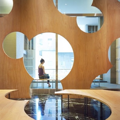
sprial cafe: marks barfield architects:: birmingham, united kingdom


images taken from cool boom


the boolean cafe: torafu architects: tokyo, japan


illy cafe in push button house: adam kalkin

this isn't the traditional setting of a cafe but still pretty cool how one shipping container can transform in a cafe in an innovation application. this posts can correlate to one of jimmy's earlier posts...


images taken from cool boom


municipal library: archea associati:: nembro, italy

this isn't a precedent of a cafe but it did remind me of the louvers sarah found during her materials research. instead of the larger scale louvers, these smaller scale red glazed earthenware tiles still can create + function the same.